Resize Text
This information relates to criterion 1.4.4 resize text, which states:
Except for captions and images of text, text can be resized without assistive technology up to 200 percent without loss of content or functionality.
This criterion is aimed at users with visual impairments that can be helped by making either the text or the whole content bigger. To explore this criterion, we need to consider two things:
- How does a user resize text in their browser?
- How do we ensure the user is able to resize text without losing content or functionality?
How to resize text
Zoom in the browser
If the user wants to make all content bigger, then they would adjust the browser zoom setting. This is very easy to do from within the browser.
In most browsers, there is a menu indicated by three vertical dots in the top right corner. If you open that menu, there is a font setting with the current size shown as a percentage and a plus and minus button for adjusting it.
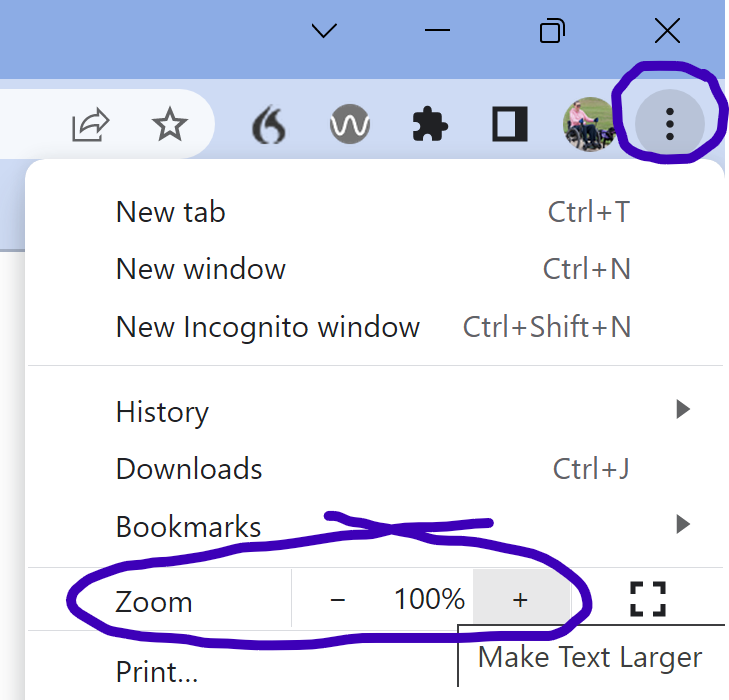
One of the advantages of using this method is that the zoom is set per hostname. So if the user sets the zoom to 120% for the BBC homepage, it should hold that setting for all BBC pages but if the user wants a different zoom setting for a different website, they can do. That is useful because different websites use different fonts, colours and sizes, so different levels of zoom might be needed.
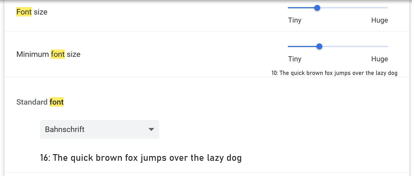
Font settings
If the user only wants to change the size of text, and especially if they want to set a minumum font sizes across all websites, then changing the font settings may be the better way. This is also in the browser menu, but then go to Settings. In the search bar, type in 'font' and this should bring up the option to customise fonts. As well as customising the size, you can usually choose your preferred fonts as well.
How to enable resizing of text
There are two parts to enabling resizing of text.
Viewport
In the <head> section of your html, you should have viewport information. This must not prevent the user from scaling. In the following example, the initial scale is set to one but the user is allowed to scale and no limit has been set on this. If you set a limit, the number that they can scale to must not be less than two.
<meta name="viewport" content="width=device-width, initial-scale=1.0, user-scalable=yes" />
Font size units
Font sizes are usually specified in your css. These should be given in relative units, not fixed units. So avoid using pixels, cm, in, etc. Instead use rem, em or percentages. This will enable the font to be resized and will prevent text from overlapping.