1.4.11 Non-text contrast
This page will show you how to check colour contrast and ensure that it meets the minimum for user interface components and graphical objects, as stated in success criterion 1.4.11:
The visual presentation of the following have a contrast ratio of at least 3:1 against adjacent colours.
- User interface components
- Graphical objects
What is colour contrast?
In general, colour contrast refers to the difference between two colours that makes it easy to tell them apart. So black and white are complete opposites and they have the best contrast possible (21:1). Two shades of the same colour are likely to have a small contrast.
When we are looking at digital colours... colours on a computer or other device, colour is made up of light. You might have heard of RGB colours. RGB stands for red, green and blue. These are the three primary colours of light. By mixing different amounts of each, other colours can be made. By comparing the amount of light used to make each colour, a colour contrast ratio can be calculated. Fortunately, we don't need to calculate it ourselves, as there are many free contrast analyser tools online.
How to check contrast
There are several online contrast checkers. My favourite is the WebAIM contrast checker  .
.
There are two ways of using this tool:
- Hexadecimal code
- Eye dropper/colour picker.
Whichever way you prefer to do this, you need to check the contrast of colours that are adjacent to each other. This is often a foreground and background colour but in the case of, for example, a pie chart, it would be the colours that touch inside the pie.
By hexadecimal code
If you are working in an application or other user interface where colours are chosen from a palette, there is usually an option called more colours. This is where you are likely to find the hexadecimal colour code. You need to put these into the foreground and background fields on the contrast checker, like this:
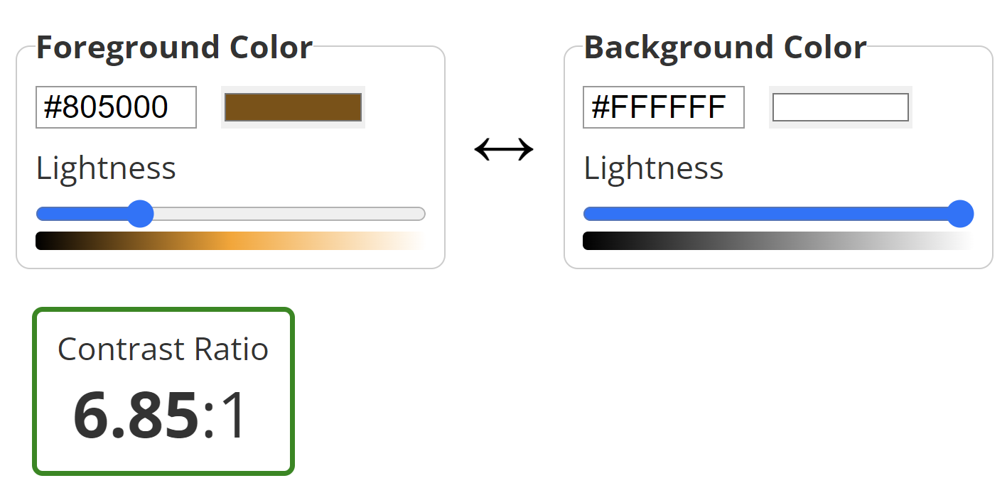
After inputting each code, hit Enter and then scroll down past the normal text and large text sections to find the results for graphical components. For most people and organisations, you need to pass at AA level.
By eye dropper
To use the eye dropper tool, first click on the coloured bar for either the foreground or background colour. This opens a new window with a dropper icon. You can also navigate there by keyboard and this works well.
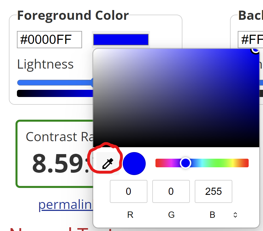
You can then move this around the screen and over the colour you want to check. Just click when the right colour is highlighted.
What items should I check?
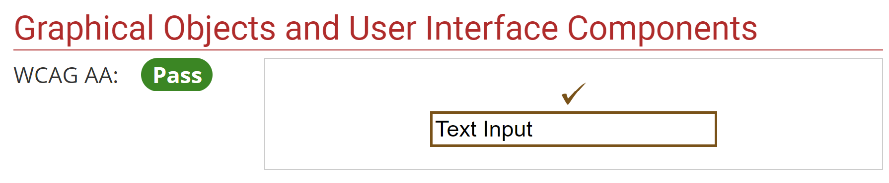
User interface components include things like buttons, check boxes, text fields... anything that a user is expected to interact with on the screen. Graphical components cover most other things that carry meaning. Logos are technically exempt but I would question the wisdom of creating a logo that many people won't be able to see properly.
This criterion is, for now, linked to keyboard navigation as well. When you tab through a webpage, the focus box that tells you where you are must also have a minimum contrast of 3:1. This will be pulled out as a separate criterion in WCAG 2.2.