Use of colour in Excel
Here are some examples of how text can be used to support the use of colour so that everyone can access it.
Progress bars
Bad example
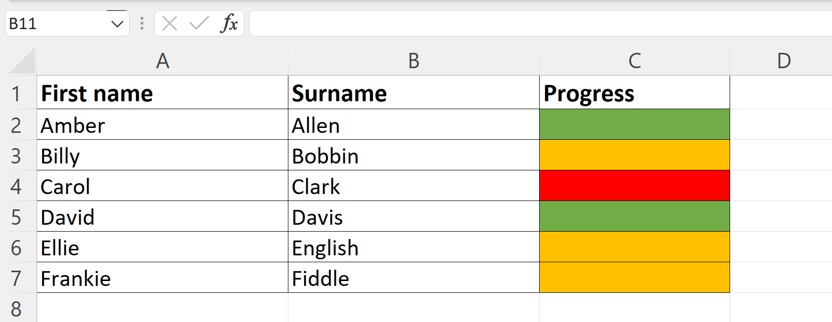
In the following example, the progress of the students is categorised by coloured bars. Green represents excellent progress. Orange represents average progress. Red represents poor progress. In many schools and colleges, colours are used in this way to show progress or achievement. However, for a person who cannot see or perceive colour, this is not accessible.
Good example
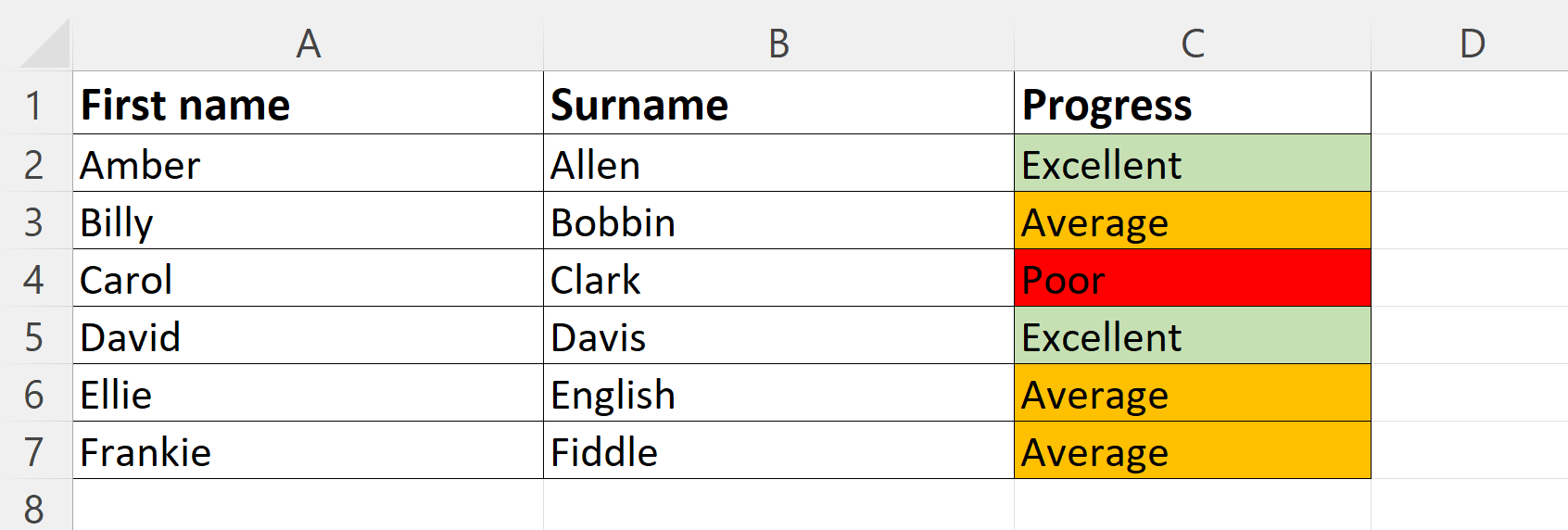
The easiest way to improve the above example, is to add in text labels. This means that those who prefer to work with colour can do but those who prefer text can also access the information on an equal basis.
Graphs and Charts
Bad example
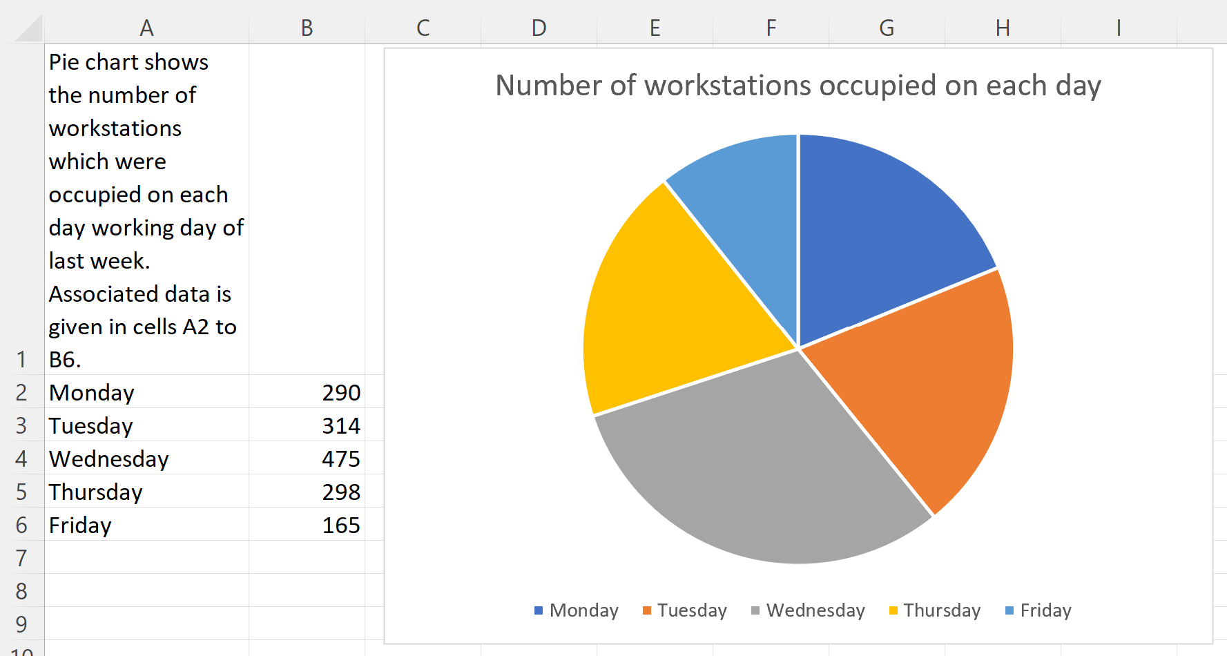
In the following example, a pie chart is displayed with a key to explain what the 5 colours represent. In the actual example, the data could be viewed by hovering the mouse over each segment, which caused a pop-up to appear with the data. However, this assumes the ability to use a mouse. It may help someone who is colour blind but would not be accessible to a blind person.
Good example
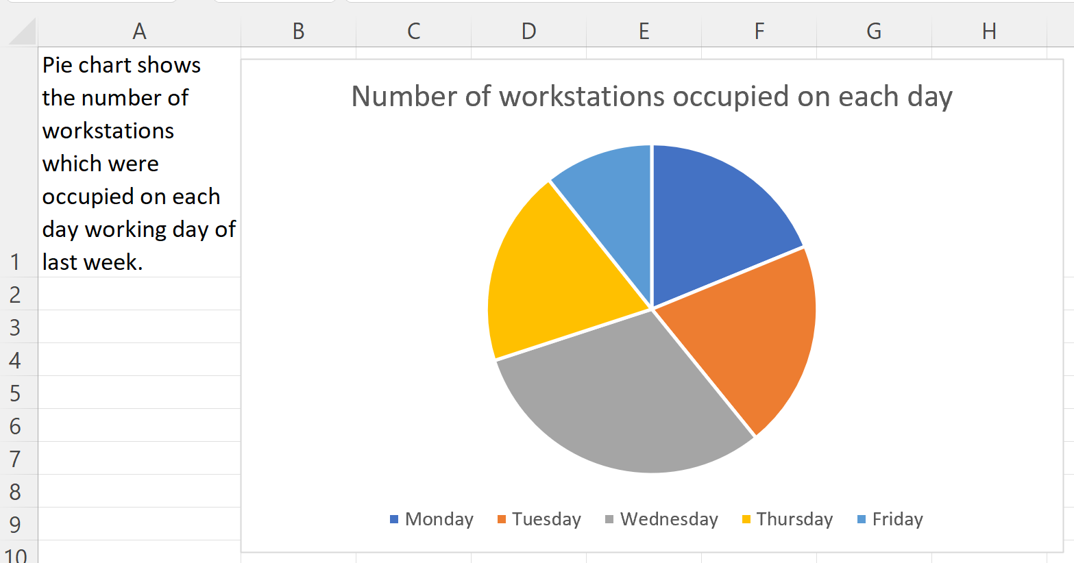
The following example shows how the pie chart could be displayed alongside the relevant data, to allow users a choice of which they access. The information given in cell A1 tells the user which cells contain the data. By doing this, all users can access the same information in the way they find easiest.